


When I was in elementary school, one of my prized possessions was my meticulously alphabetized and impossibly heavy binder of DVDs. On most evenings, I would thumb through it aimlessly, admiring the graphics on each disc and marveling at my impeccable taste in cinema (Bro, have you ever heard of Gladiator?). But perhaps my favorite thing about those DVDs was something that last millennium’s civilization once called Bonus Features. These were the deleted scenes and interviews included on the disc that were only available to erudite scholars like myself who hauled their ass to Best Buy to buy a copy. By far the best type of Bonus Feature—and a lost art form—was the Director’s Commentary, which was a version of the movie that included a track with the director (and sometimes a few actors) talking over it. At a time before we had Instagrams and Criterion Closets, it was the closest thing you had to a window inside the minds that made the things you were into.
So without a DVD—or even a movie, actually—what follows is the magazine version of a Director’s Commentary on i-D’s AW26 issue. Not because we want you to buy it (if you do, it’s now available at your local mag-monger, and there also are a couple copies left to order online here), but because there’s nothing more delicious than the rare, esoteric information that gets trapped inside physical media.
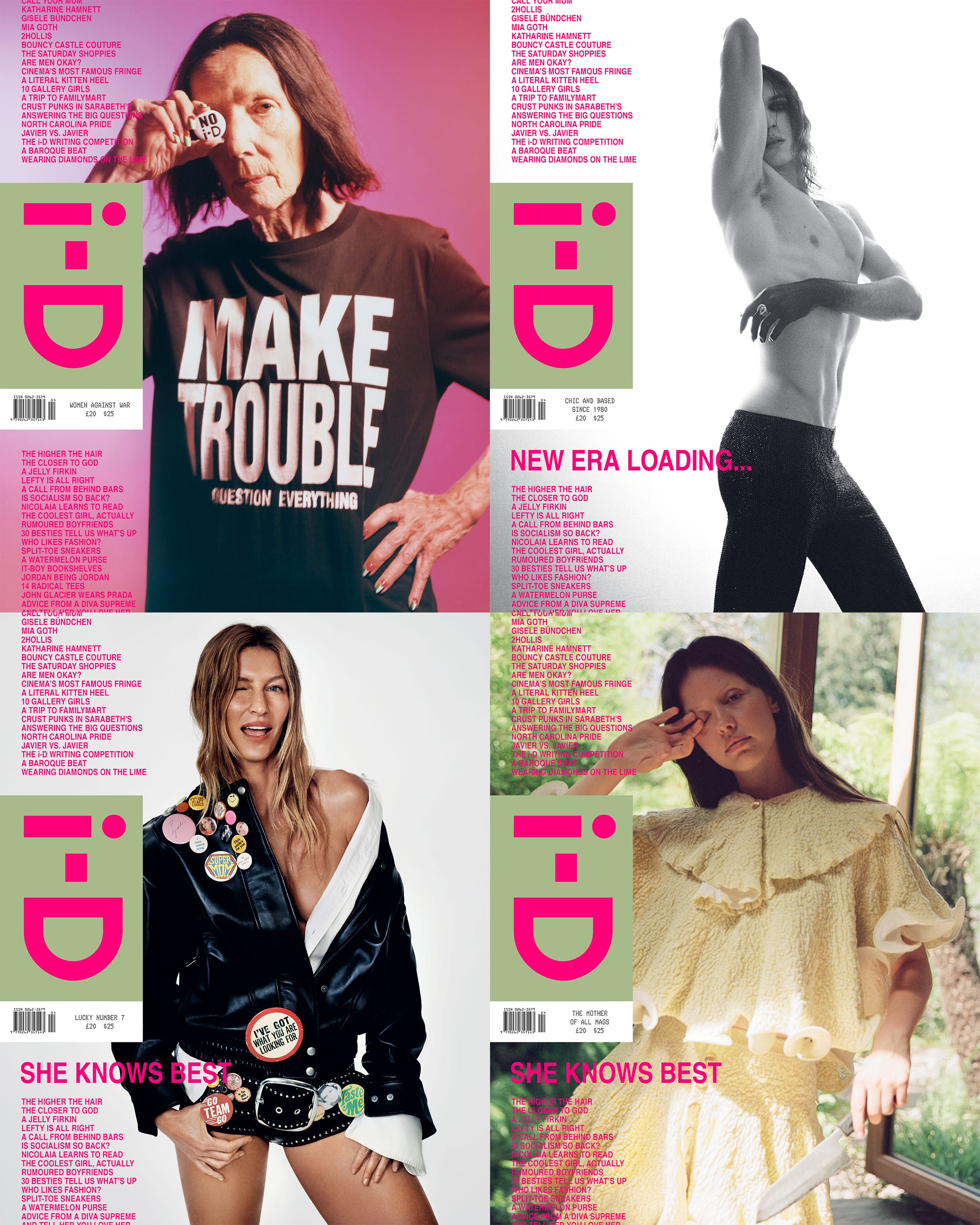
Ah, our covers. You might look at these covers and see icons at the top of their respective fields, photographed beautifully, and looking impossibly cool. What I mostly see is fluorescent pink, which serves as a type of connective tissue for the entire issue. What I like most about this pink is that the way it’s printed is impossible to see on a screen. In its printed form, it has an intensity, vibrancy, and presence (it even fades over time) that makes you glad you picked up something printed on paper. That was the exact idea, courtesy of our art director Brent David Freaney.
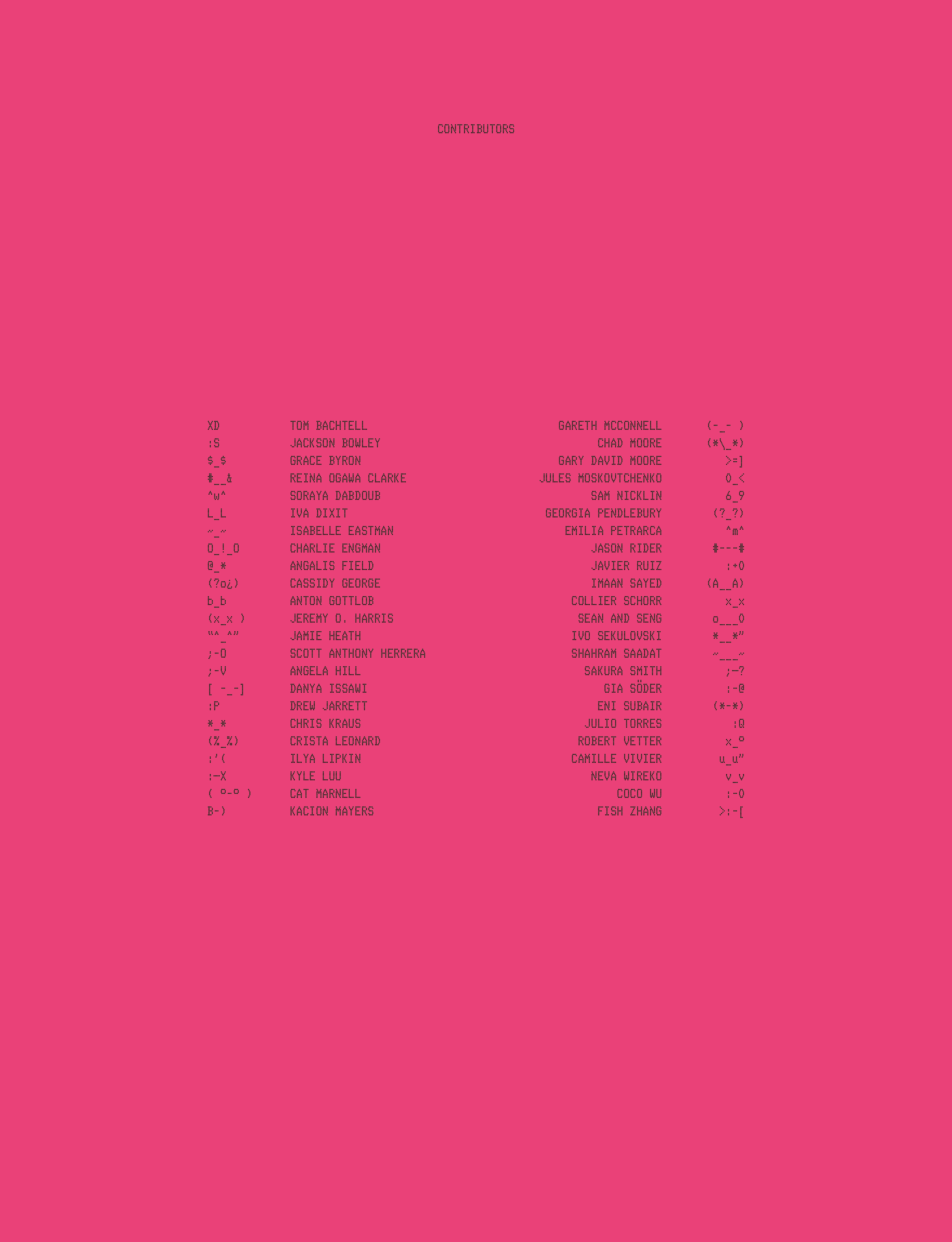
P. 38: One of the most fun parts of making magazines is being able to leave Easter Eggs noticed only by people who pay way too much attention (and maybe only you). Something we’ve done for the last four issues of i-D is assign each of our contributors a typed emoticon—like “i-D” itself—which appears at the bottom of the pages that they worked on. You will also notice that the entire page is incredibly pink.
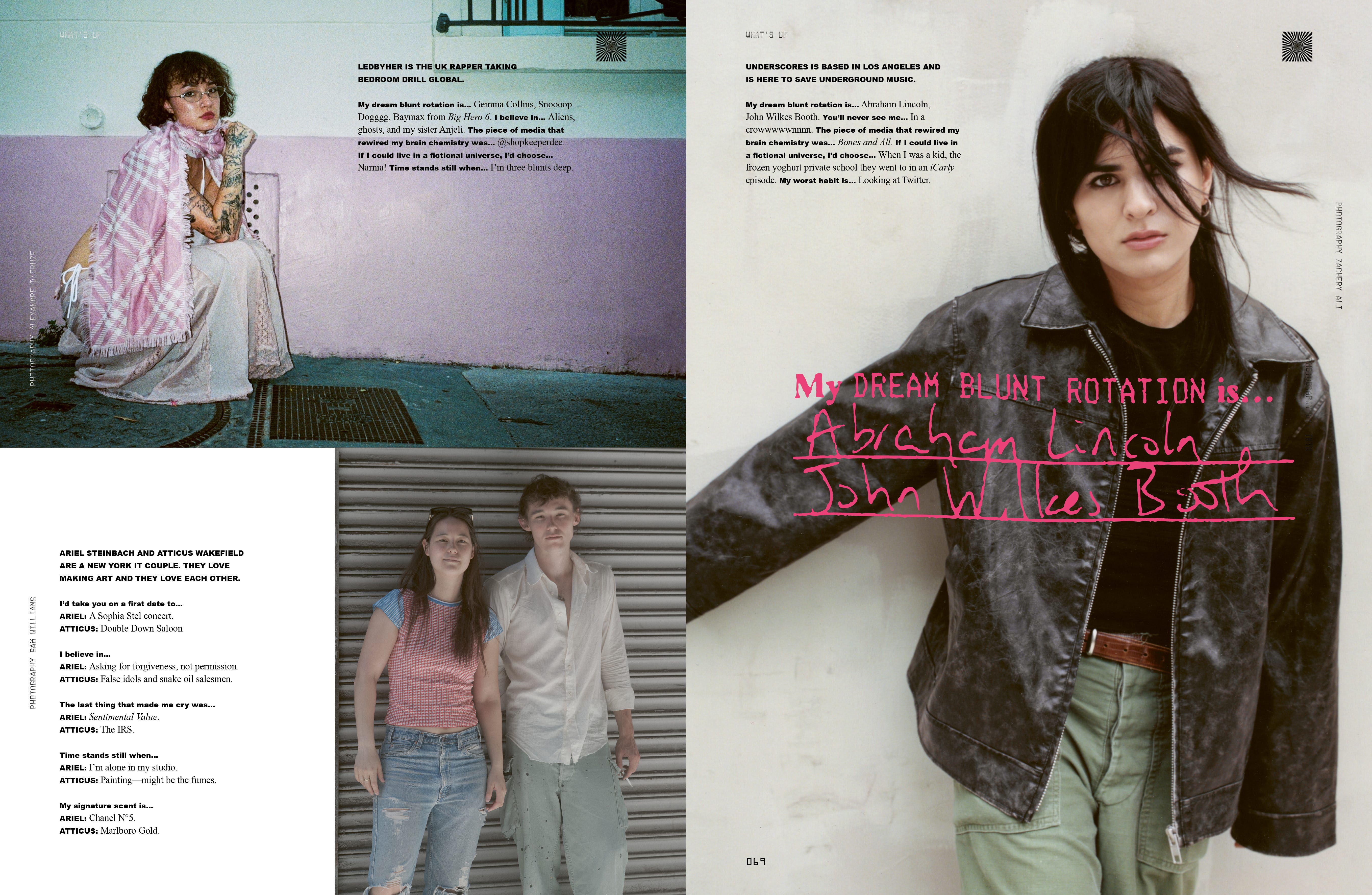
Pp. 66–67: “What’s Up” is a section that we started doing in the last issue that was inspired by a portfolio from 1993 that Editorial Director Steff Yotka found in the archive. The idea is quite simple: take a couple dozen of our favorite people (some you know, some you don’t), snap their picture, and ask them some questions. This approach to storytelling was a seminal part of the early issues of i-D, and it still works very well today. This issue, we added a questionnaire that each participant had to fill out by hand. We then scanned their responses and incorporated some of them (in pink, obviously) into the layout.
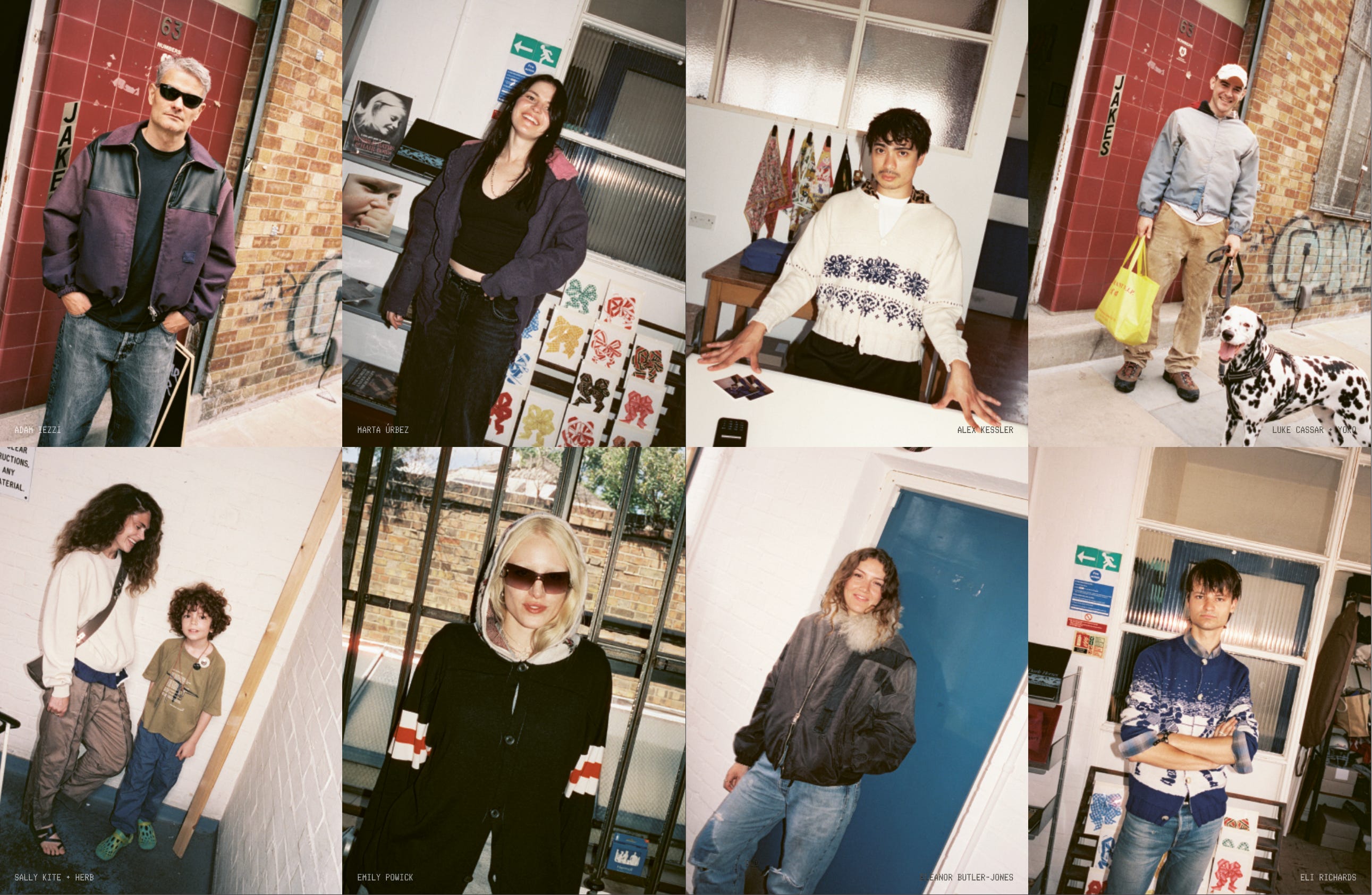
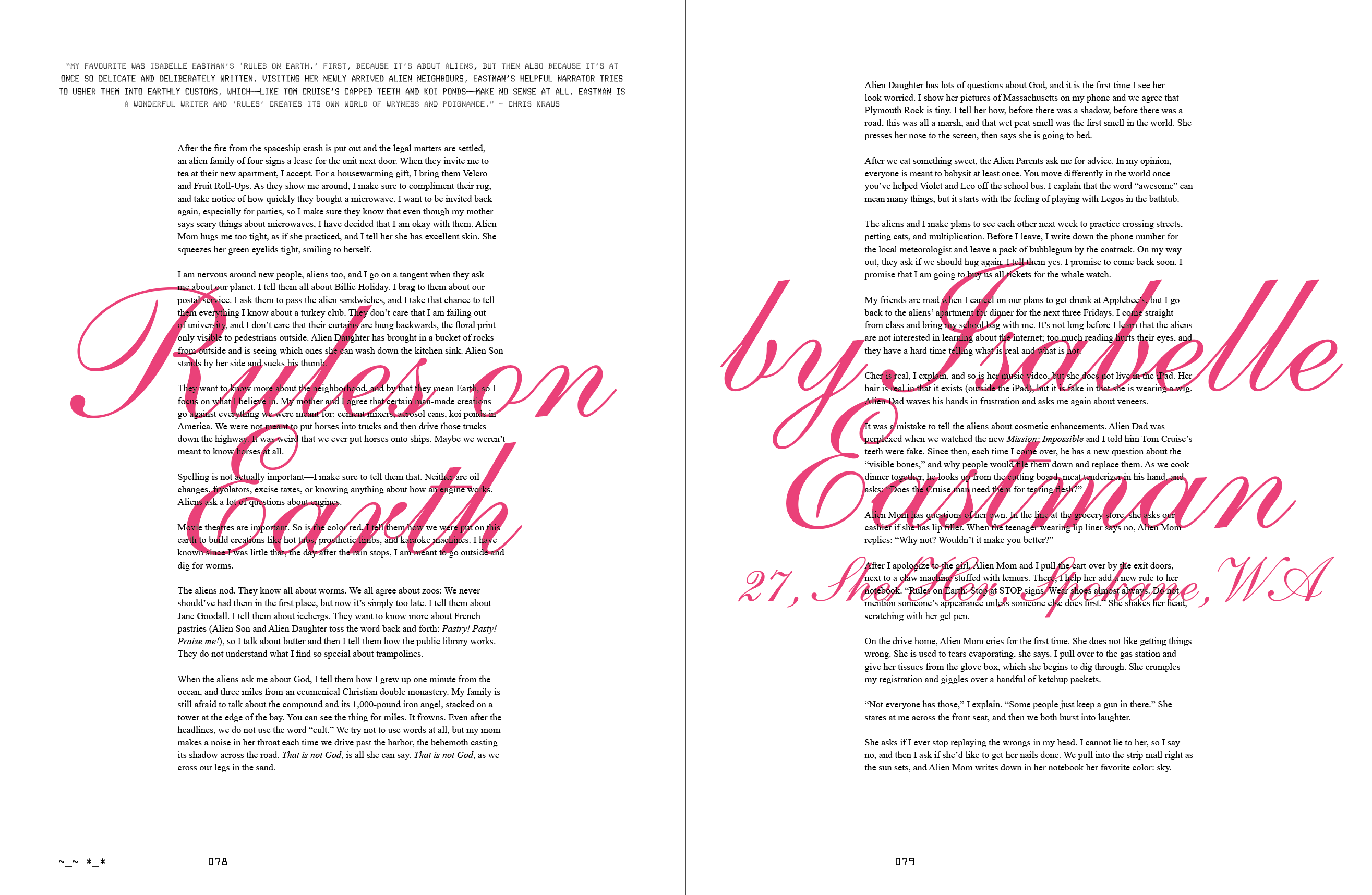
Pp. 124–125 and pp. 76–77: Mag-making is inherently about nerding out, and we love nothing more than a callback to the archive. i-D’s archive room is literally the central location in our London office, and spending time there is inspiring on a near-hallucinatory level. There’s a lot of ways to reference a magazine’s history in the present. For our profile on Jake’s, we used i-D’s iconic Straight Ups format to document the denizens of the beloved London brand’s pop-ups. (If you’re wondering who the dashing gentleman in the white cardigan is, that’s Deputy Editor Alex Kessler, who wrote the profile.) Another way to reference the archive is to find something that disappeared for some reason and simply bring it back—like we did with i-D’s defunct Writing Contest. If you can believe it, we got over 2,000 submissions for the Contest—and if you can believe it, we read every single one of them. This piece by Isabelle Eastman from Spokane, Washington, is one of the winners.
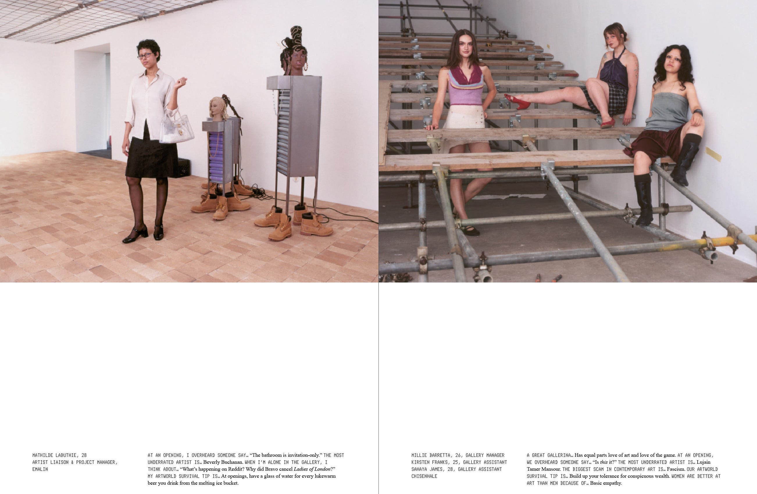
Pp. 138–139: If you forced me to tell you what my favorite story from the issue is, I would probably say Associate Editor Marley Wendt’s portfolio on gallery girls in London. It has all the hallmarks of a classic i-D story: underground spunk, anthropological levels of honesty, and deeply fabulous people you’ve never met before.
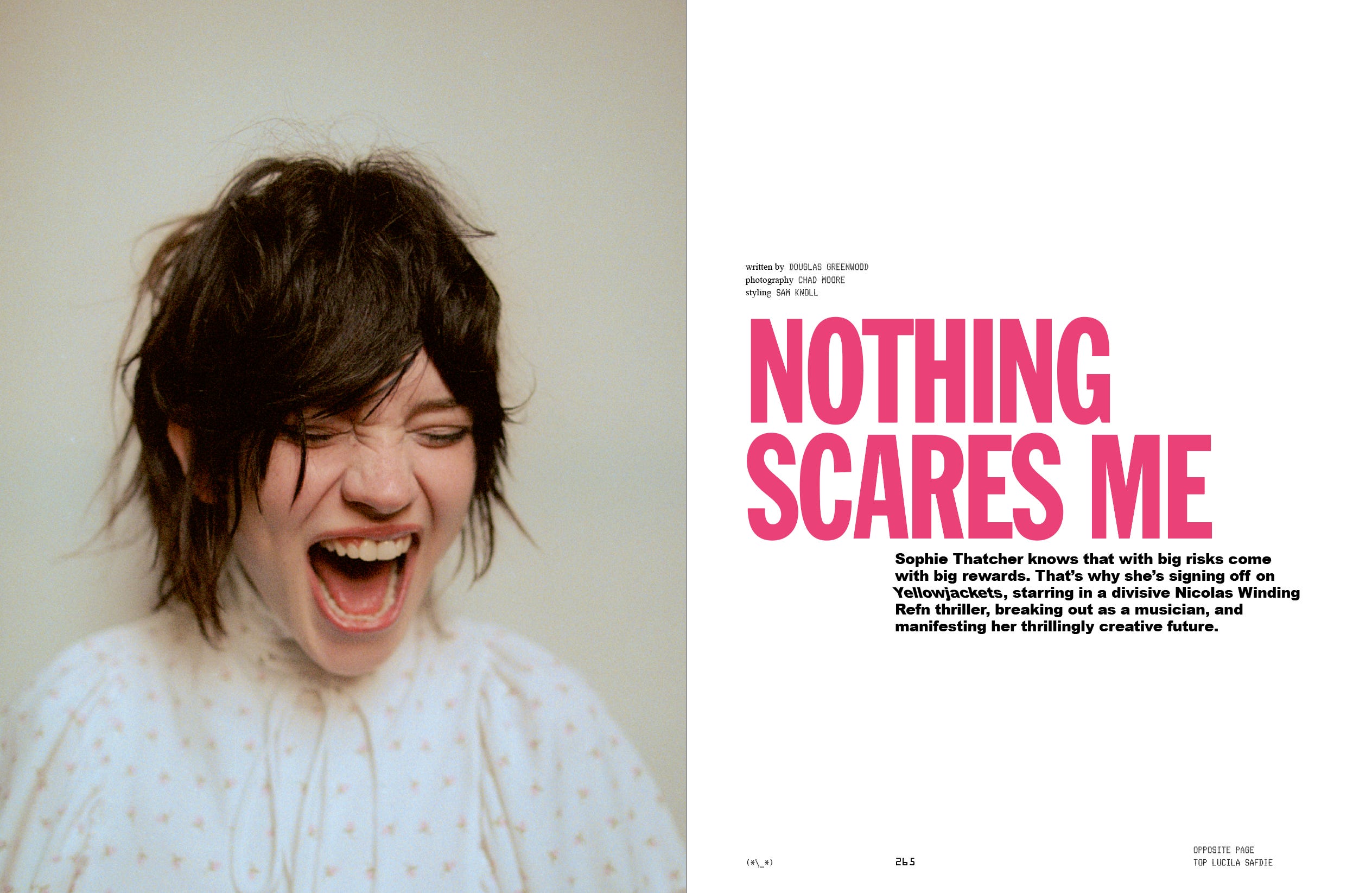
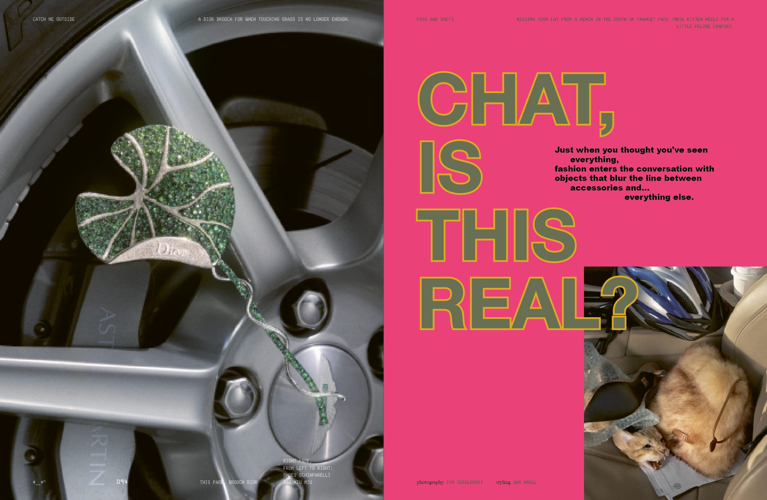
Pp. 264–265 and pp. 92–93: Perhaps one of the great paradoxes of mag-making is the reality that you are making something that some people will read dutifully line by line, but also something that most people will flip through haphazardly. That’s why we put a great deal of creative focus on what we call “openers,” the first spread in a story. These are the proverbial signposts that pull you out of skimming by capturing your interest—whether that’s your interest in wacky accessories or Sophie Thatcher looking spooky.
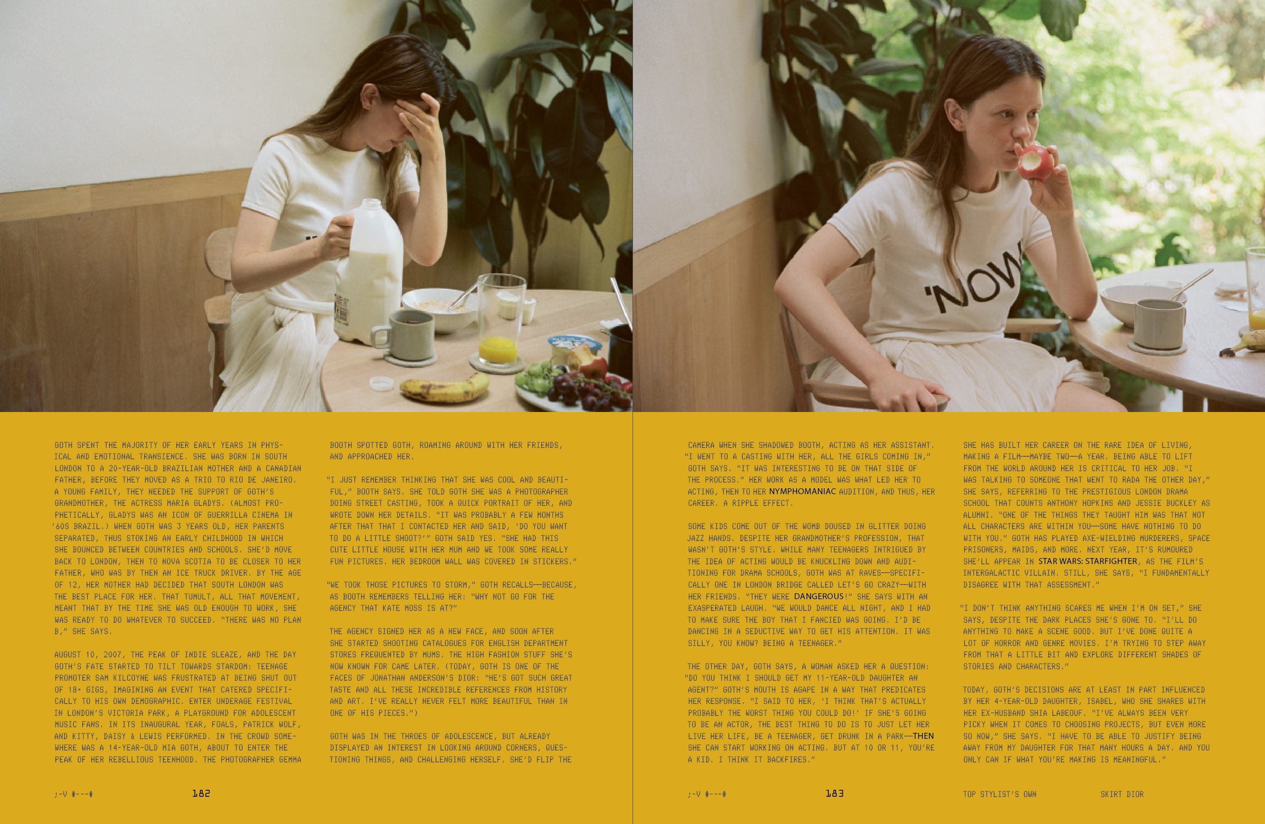
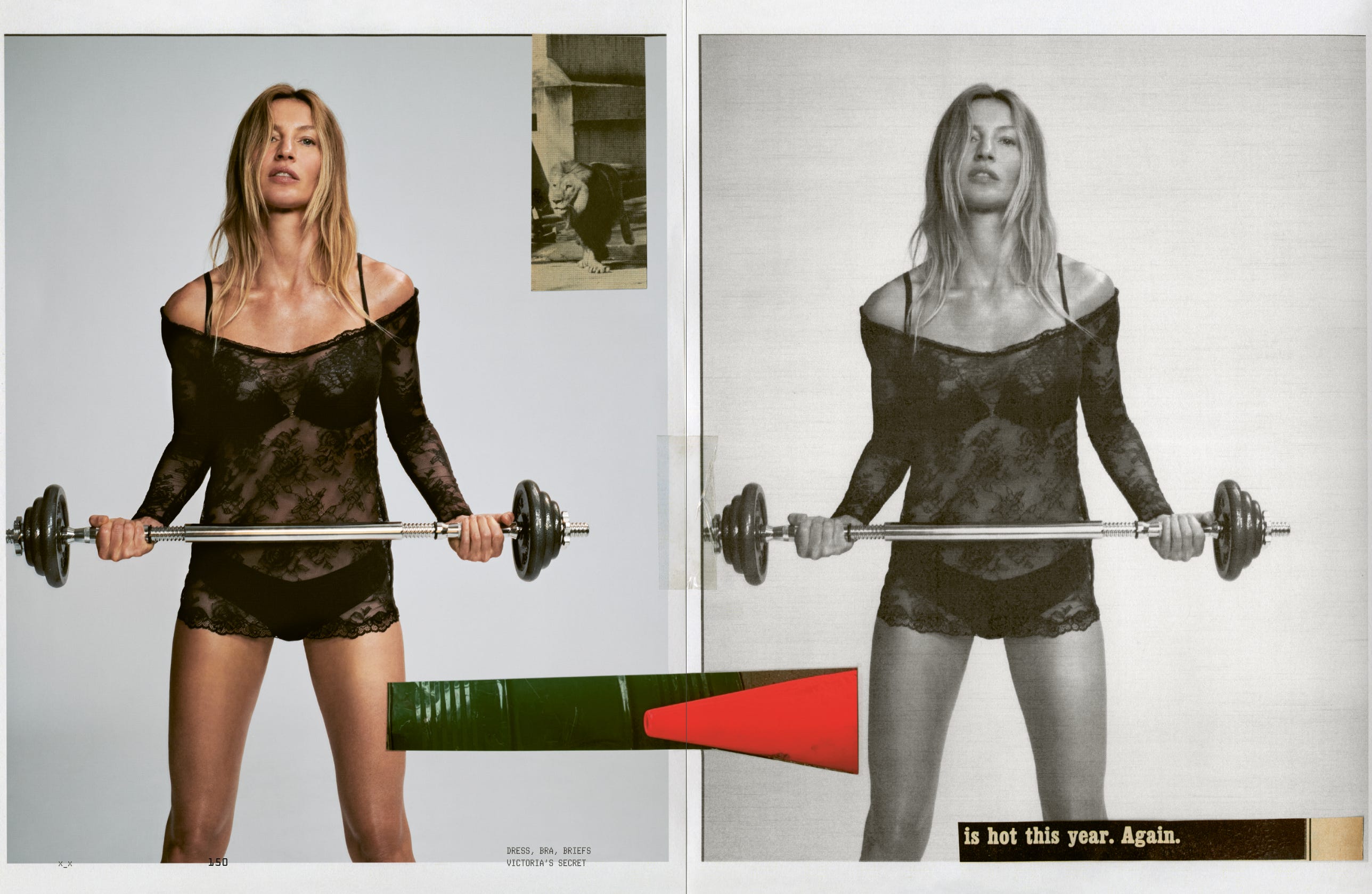
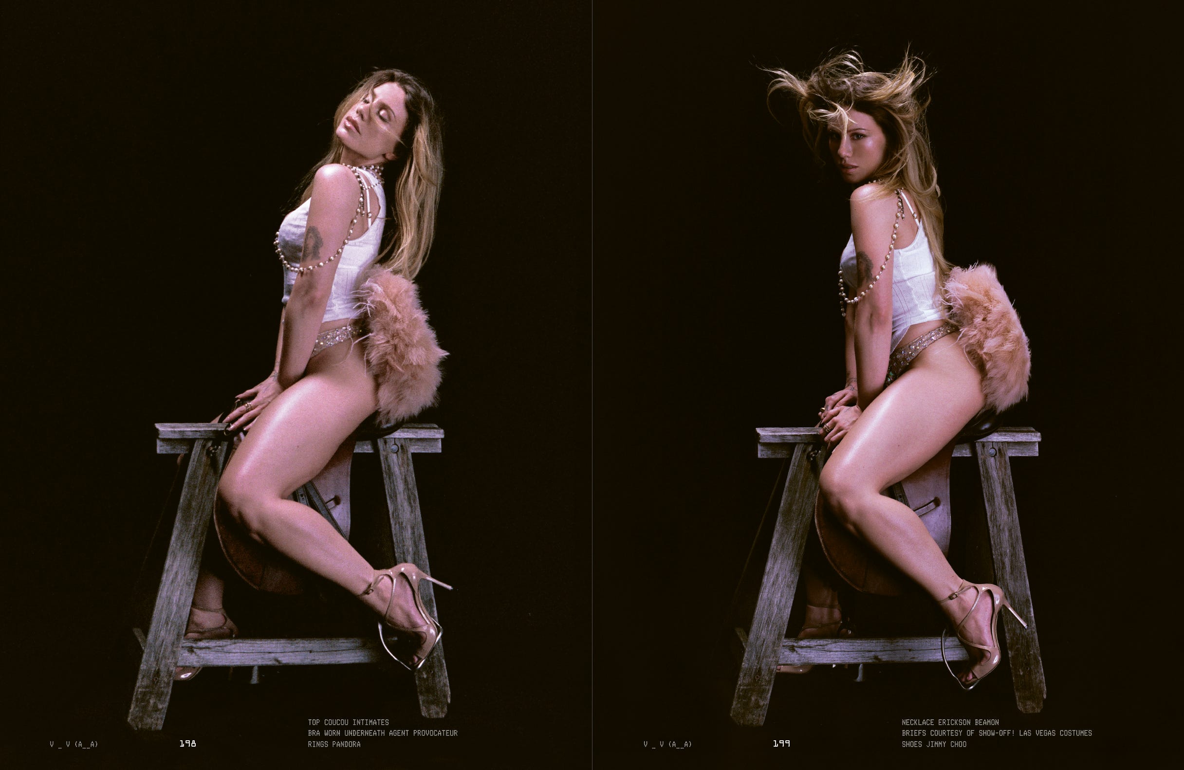
Pp. 180–181, pp. 148–149, and pp. 198–199: I apologize in advance to those who know me because I say this all the time, but at its core a magazine is… one page glued to another. Sounds stupid, but that’s exactly the point. Sticking things together is the principle act of making a magazine, and that’s something you can create ideas with and have fun with in a myriad of ways. One of my favorite ways of sticking things together is with spreads in which similar images (or even two copies of the exact same image) are printed across from each other. It has this instantly cinematic effect, like you’re seeing two frames in a spool of 35mm film. It also has a special uncanniness when you’re holding the magazine with each hand side by side, with each of your eyes side by side, that is inherently gripping on a reptile-brain level. It’s something that you cannot replicate in the vertically-dominant zone of social media—but I’m curious if the new folding iPhone might change that.
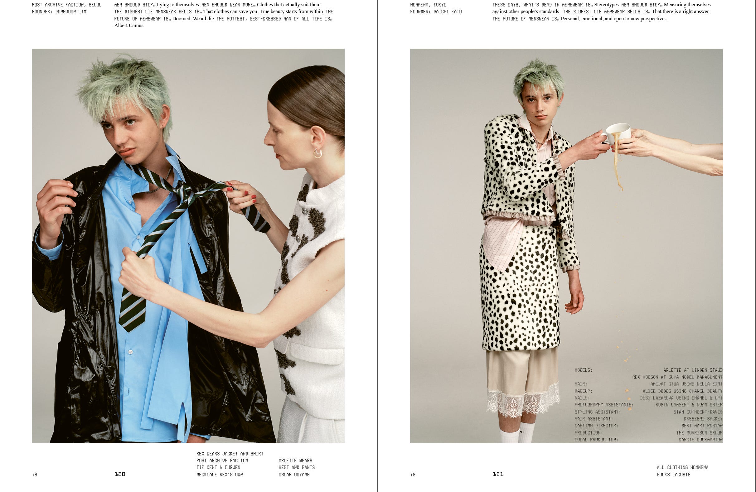
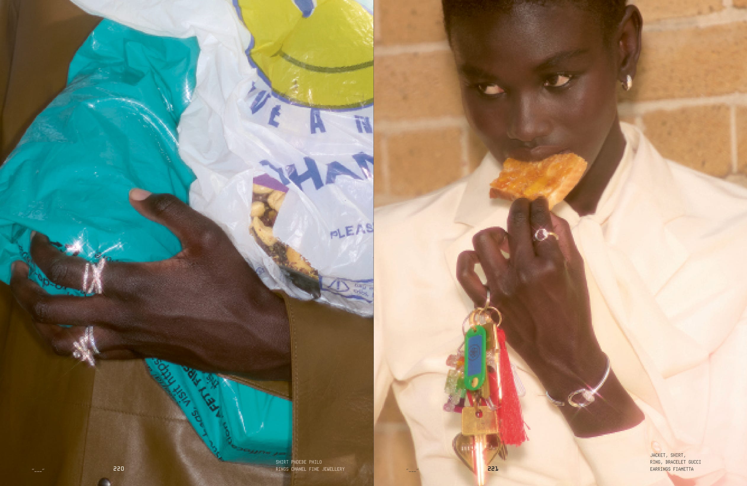
Pp. 118–119 and pp. 220–221: 9 times out of 10, I find fashion editorials incredibly boring. No doubt, there are masters of the genre who have blown my mind and changed the way I think about images. But most of the time, my brain just goes, “Okay, cute person, cute outfit, flip, flip, boring, next!” So what makes a fashion editorial actually good? Sometimes it’s about knocking your socks off on a purely visual level. Or about a force of personality or casting that brings a human gravity to the imagery. But some of my favorite fashion editorials ever sing because they have a concept that engages your mind just a little bit. Take Jackson Bowley and Alex Kessler’s shoot about the state of menswear—yes, you can just shoot a dude looking hot in clothes, but adding the maternal figure dressing the model adds a dimension of Freudian fun to a study on what masculinity means today. Or take our fine jewelry story, shot by Shahram Saadat and masterminded by Fashion Director Clare Byrne, which places deeply luxurious items into gloriously unluxurious everyday settings. By simply flipping that context, you suddenly have something with semiotic tension that’s also powerfully chic.
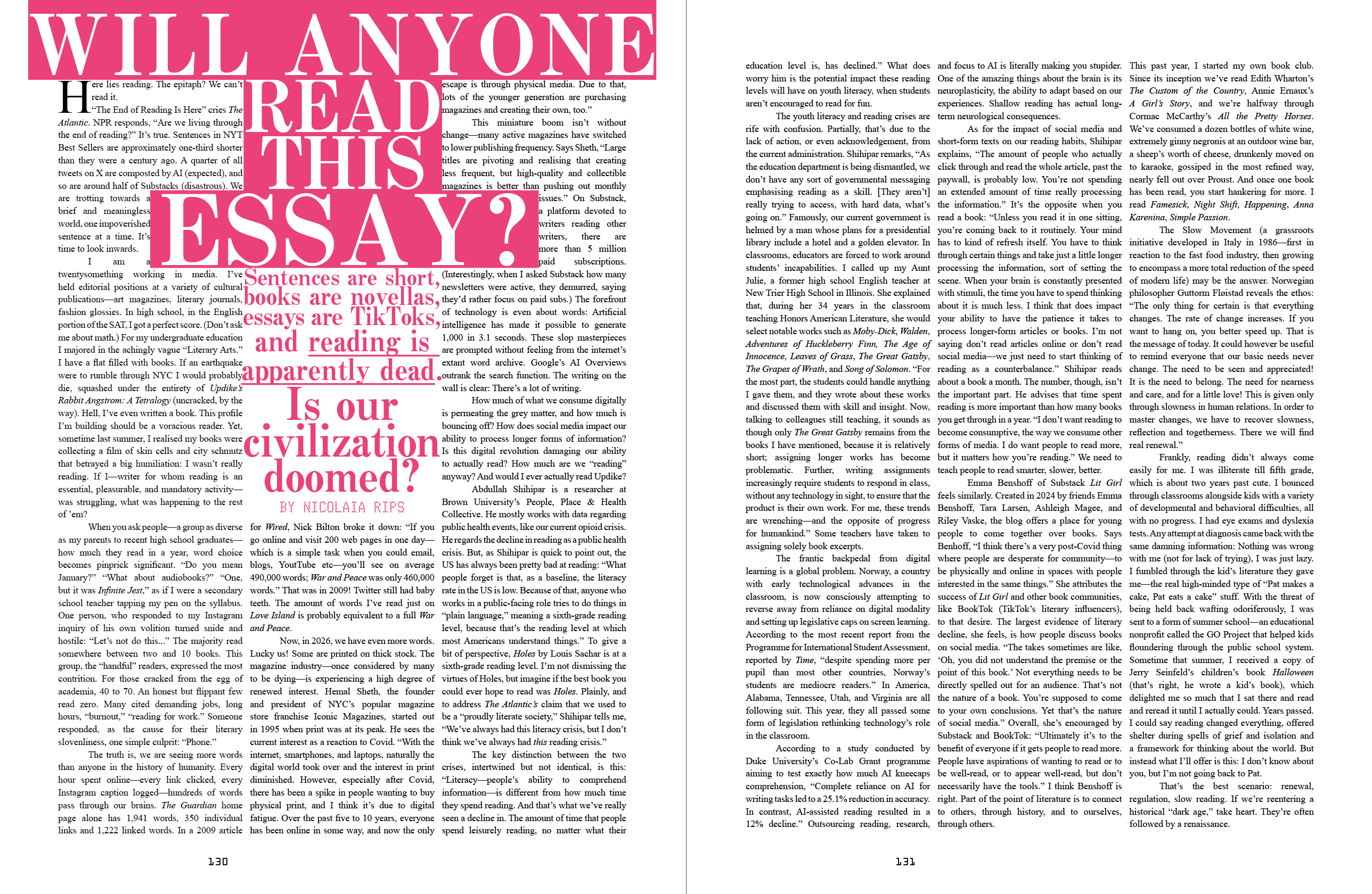
Pp. 128–129: i-D is a magazine that has fun, but at the end of the day, we’re going to make you read and have real thoughts at some point along the way. To that effect, Senior Editor Nicolaia Rips wrote this incredibly astute and funny essay about the fact that people don’t read anymore. I would tell you more about it…but just find a copy and read it yourself.
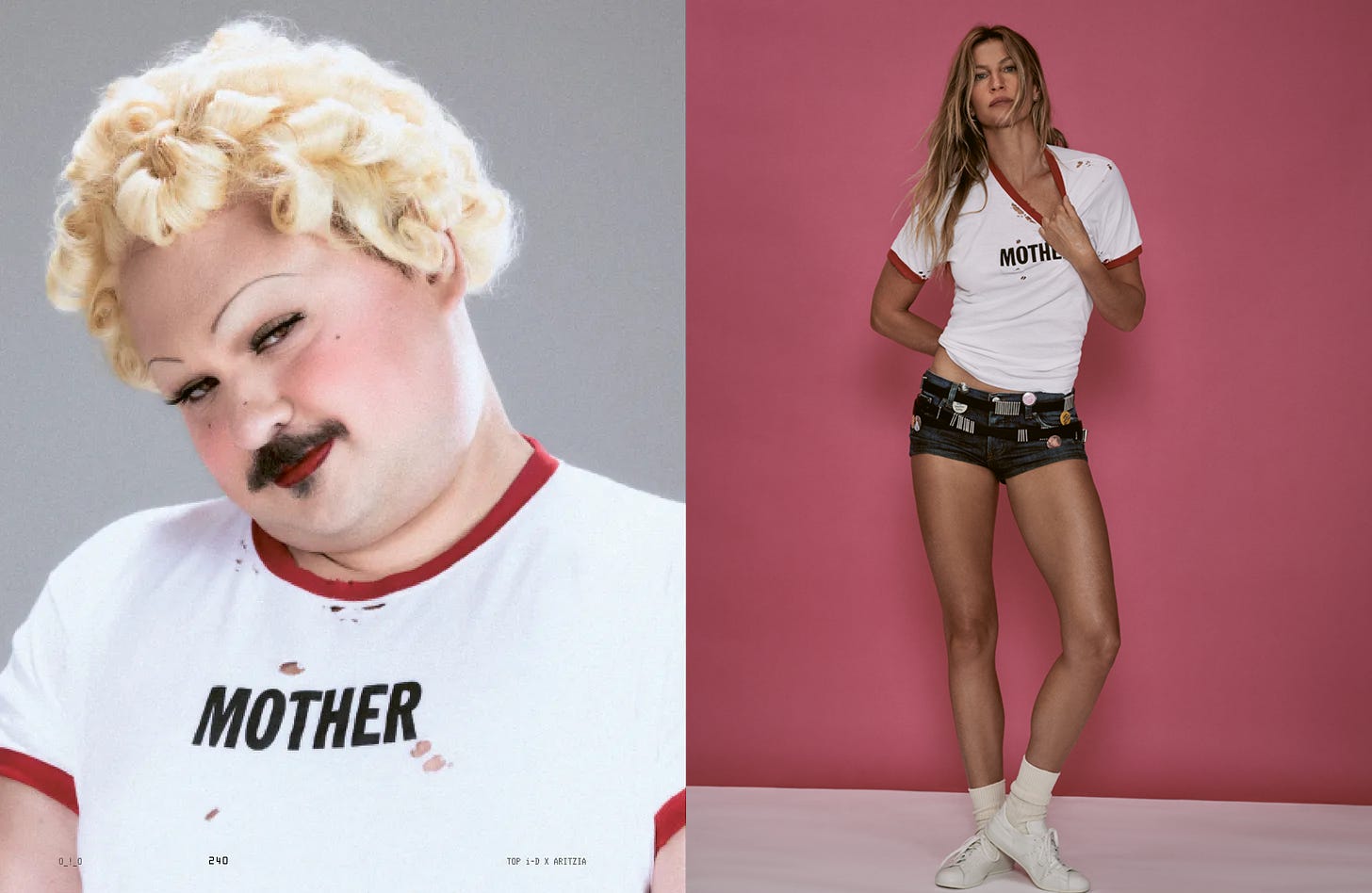
Did you catch the MOTHER tee on page 153 and 240? This easter egg is an Aritzia exclusive, in collaboration with i-D Magazine. A limited edition run will be available to purchase on Aritzia.com from tomorrow, September 26.
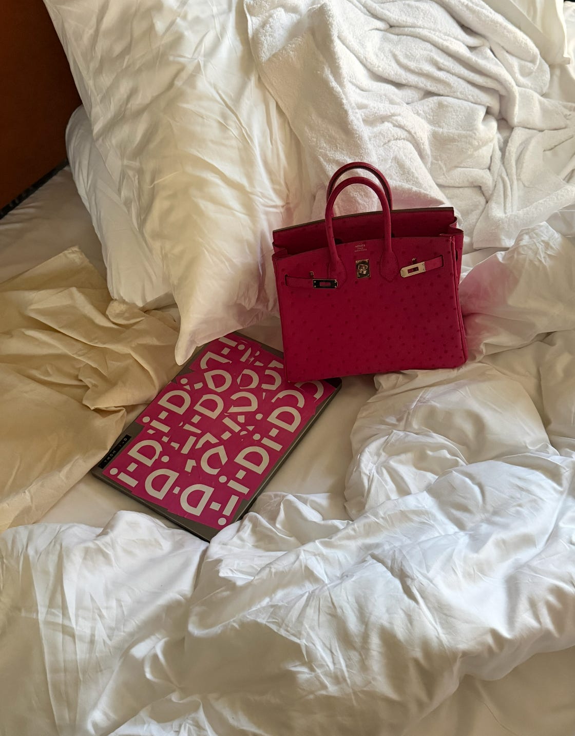
Lastly, I wanted to take a moment to sign off and say thank you, since this also happens to be my last issue as the Editor-in-Chief of i-D. It’s the honor of a lifetime to make magazines for a living, and an even bigger honor to have you guys read them, whether it’s here, elsewhere online, or in print. Since the moment I started working in publishing, it’s been treated like a frail artform on the verge of extinction. And yet here we are, writing with laptops that match our Birkins…

Love love love this